
Hills & Valleys

Many women in my life have had an abortion. Or two. We’ve sat together, holding hands in the waiting room. A drive home. A pint of ice cream. A new, uninterrupted shot at the future ahead.
I am one of these women.
Many of my friends have not been able to afford health care. Putting off appointments. Waiting until payday to take care of themselves. Fearing shame in the exam room on top of the bill. I have also struggled to pay for care.
Hills & Valleys, the latest piece produced in my studio, only exists because of legislation successfully passed by the Walker administration in Wisconsin, defunding six Planned Parenthood health centers in the past six years. These laws not only limit access to health care as well as safe and legal abortion, they restrict our independence.
This post is dedicated to the community of people who helped me bring Hills & Valleys into being and to Planned Parenthood for the past century of successful leadership in the national fight for health care and human rights.
MAKING HILLS & VALLEYS:
I began collecting signage from defunded Planned Parenthood health centers in Wisconsin in the fall of 2013. The first time I pulled up to the loading dock, five large signs from three clinics were loaded into my car. Six smaller signs would make their way to my studio before the project was completed.
For two years, I considered how to best honor the materials. They sat inside my garage, greeting me as I parked my car. As a lifelong supporter of Planned Parenthood and women’s rights, I recognized the aluminum signage as a powerful symbol of love and loss. I knew not to hurry. Like other political pieces I have made, what ever it needed to be would come. Some pieces take time.

It's strange to wish the materials you're working with weren't available in the first place.
With that said, I was hit immediately by the need to incite action with the material. These signs had the power to build a symbol capable of confronting the precarious state of reproductive rights in the United States.
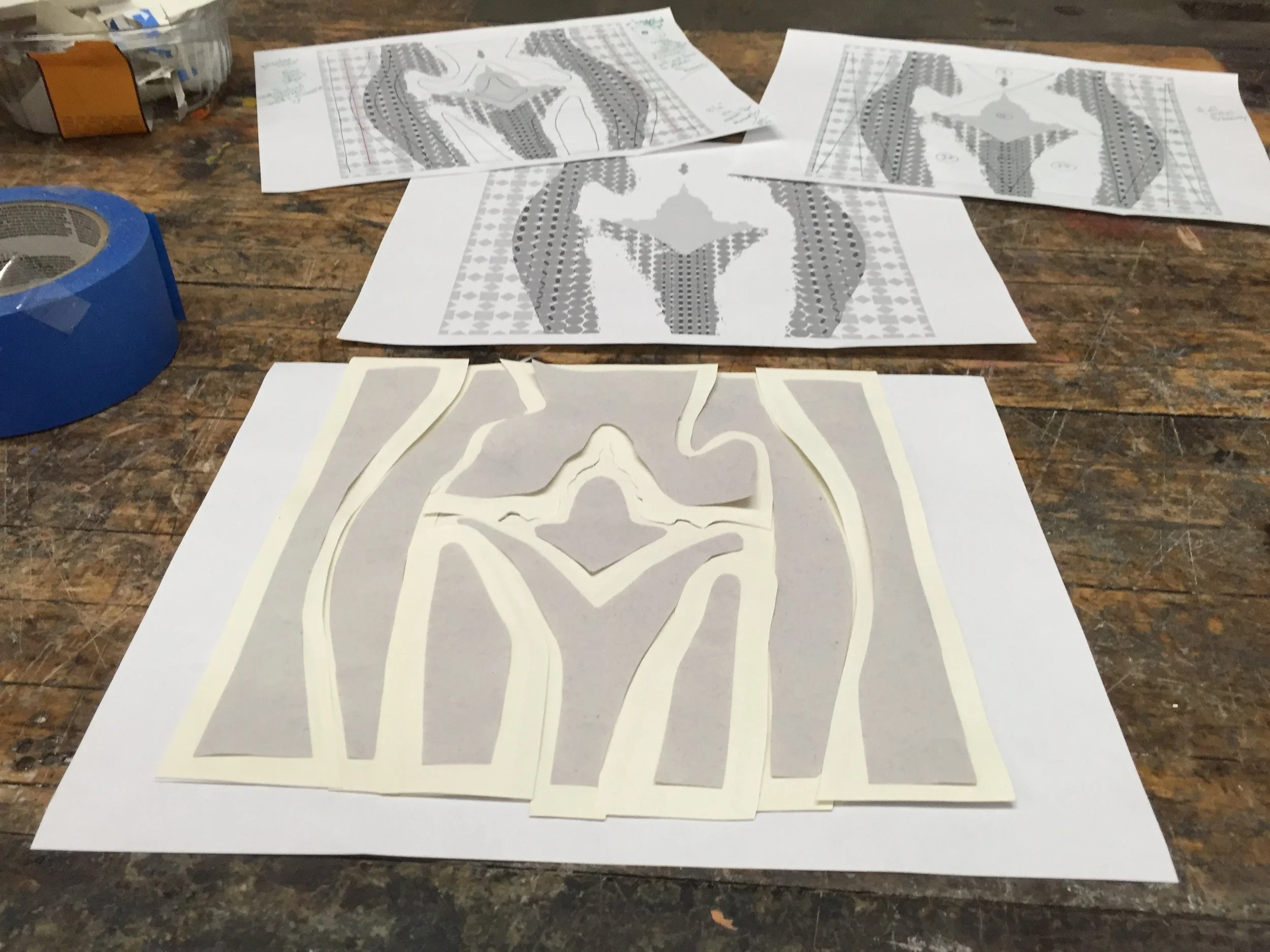
In October 2015, a design appeared moments before I fell asleep. The next morning, I woke up to a rough drawing of a pair of women’s hips standing in front of a quilt. Across her pubic mound rose a vajazzle of the US Capitol.

The first digitally rendered design of "Hills & Valleys"
Kind of like alphabet soup, the components of Hills & Valleys had been swirling around in my mind for years. The first element was the quilt. It was inspired by a project I assisted Greely Myatt with in 2009. We spent months transforming scraped street signs in Memphis into beautiful reflective “quilts” to cover an air conditioning unit on city property. I loved the way the industrial materials spoke to heritage and the domestic experience when altered--feminizing the message of the metal, while giving it an arguably enlightened second life.
After the design came to me, I reached out to Greely to see if he would be okay with me incorporating his visual language into the piece, to which he replied, “Of course!”.
Thank you Greely.
In 2010, capitol buildings began to appear in my work. Each morning I drove to the base of the Wisconsin State Capitol on my way to the graduate art studios at UW-Madison. It took a few months before I realized how much I was looking forward to that part of my commute, which sparked a fascination that inspired weekly tours of the building, investigating meta-narratives of state, symbols of government and emblems of national power.
The last element for Hills & Valleys entered my vocabulary while driving a group of employees to a job site in the summer of 2015.
I have to admit, I was immediately struck by a wave of feminist boredom when I heard of vajazzle. A close relative of lawn mowing and other metrosexual activities, vajazzle seemed akin to a merkin's insidious and less funny cousin. However, the glistening red hearts and hardcore Hello Kitties continued to flash through my mind days after my first Google search. It was then I realized I wasn't bored by vajazzle at all. In fact, reevaluating vajazzle as a component for self-expression recast it as a potentially valuable cultural signifier to work with in the studio. Expression through artifice has been a part of women's practice in patriarchal cultures for millennia, after all.

To better understand the layout of the mirror pattern, I bedazzled it on to a pair of pantyhose.
The mirror pieces used to create the US Capitol vajazzle element had to come from Hobby Lobby. If Hills & Valleys was to incite civic action the audience needed to see themselves literally reflected in the US Capitol. And while Hills & Valleys needed to be beautiful and speak to the power of a civic reclamation of human rights, the materials language had to tie to back to the entities most committed to stripping of those rights.
Shortly after the design for Hills & Valleys gelled, my friend and fellow UW-Madison alum Glenn Williams asked if I would be interested in working with his Advanced Sculpture class at UW-Milwaukee as a visiting artist during the spring semester of 2016. Excitedly, I agreed and asked if there was a metal shear.


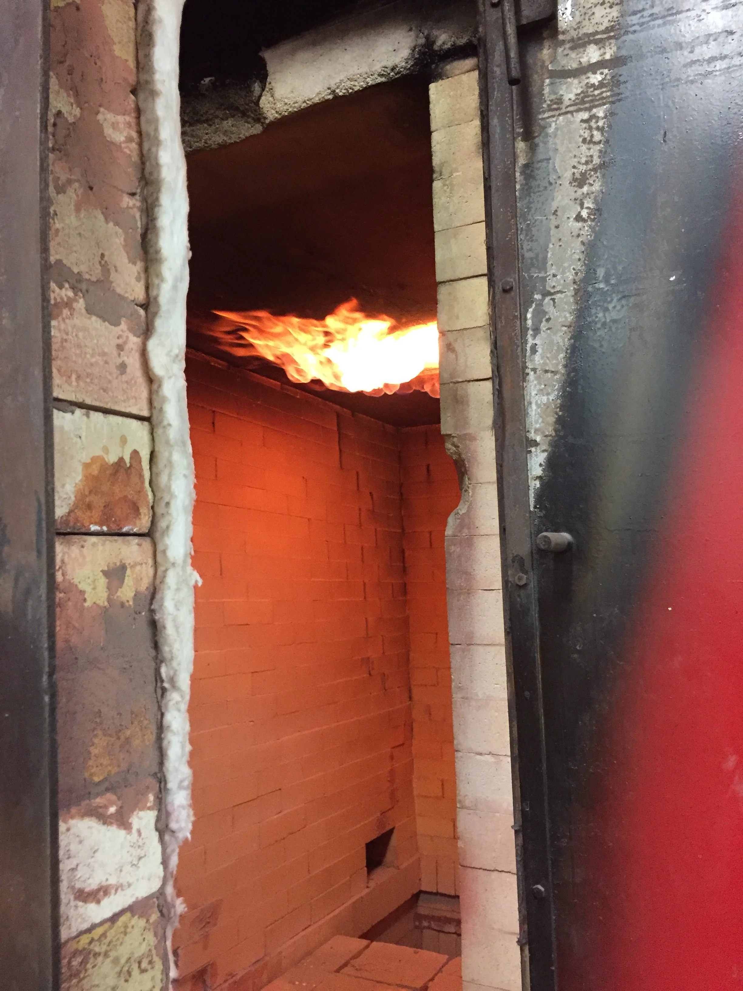
In February 2016, I began slicing the signs into strips, separating the lettering from its background. The first week of shearing the signs down was deeply upsetting. I couldn’t shake the feeling I was physically partaking in what legislatures across this country take part in everyday- the careful deconstruction of women’s access to health care and legal abortion. It was only when I began punching circles out of the strips with a hammer and a jeweler’s punch, I began to feel hopeful about rebuilding. I sensed regeneration-one of my favorite parts of upcycling materials.
With the basic design and dimensions set, the rest of the piece, including its overall look and engineering, developed responsively in the shop. I followed the quantity of available colors, materials and structural needs as issues presented themselves, and kept adjusting to make it work. One example- I decided not to clean or paint the original signs, so they would remain affectively representative of their previous lives as street signs, which had guided patients into health center parking lots across the state. Shiny, marred and oxidized in places-the soot and dirt on the signs were the clues I was relying on to peak the curiosity of viewers in investigating what the image was made of.
It was only after the last of the signs were pried up from their backings, the original color palate I thought I was working with (green, white and silver) expanded to include tan and two shades of turquoise. Three new colors were introduced into the design, which was unexpected but completely welcome! The residual glue lines and chunks of embedded plywood left on the backs of these signs added textural elements and another level of material language to the piece.


From the inception of the design, it was important to me that Hills & Valleys was built to travel. I had no opportunities lined up, but building it with that vision in mind made it capable of being able to do so. (You never know, right?) After years of presenting work within art communities, public libraries, art museums and hospitals, I became ever more curious about the impact this piece would have if presented outside of the box, on tour, and was able to make in contact with divergent communities of political interest. The issues this piece engages are based in the bedrock of our democracy. It was bound to speak beyond the borders of Wisconsin.
Following the curvature of the image, I cut seam lines along the paper pattern I had been using to map out the piece. It would be able to separate into nine parts. This feature allows Hills & Valleys the ability to exhibit in locations that may not have industrial loading docks, large freight elevators and it would be easy to ship.


Shearing the signs and prepping the aluminum required a large space and access to equipment at the shop, so I punched dots in my studio when I wasn't there. After a few weeks of hammering circles, the enormity of the undertaking presented itself. Originally, I thought I'd only need larger dots ranging from 1"-1/2", but as the image developed and new colors appeared, I realized smaller circles were necessary. In order to achieve the gradient I wanted, I needed to limit the amount of the aluminum shining through from beneath. Punching down to 3/16" became the new reality.
Rather than wallow in how much work was ahead or accept that the next few years of my life would be spent scooting metal through a punch, I put out an open call on Facebook asking for volunteers. All I required was that volunteers must support women’s reproductive rights and be skilled with a hammer.
Over the course of two months, thirty-two volunteers ranging in age from 14 to 82 helped process the materials, bringing friends and family to join in, traveling across county lines and state borders to help expedite the process. It led to something totally unexpected happening. During the period of volunteer involvement, I became keenly aware that something far beyond my grasp was taking place in the studio. It was the first time I had ever experienced my art practice as a conduit for grass roots activism. While I offered direction and kept the project moving forward, it was with respect for and in tandem with the community that was being created within the space.
I really can't say enough about how important this experience was. It was simply incredible to be a part of.


In order to pattern the dots, I needed to be able to stick them on to the aluminum surface temporarily, so adjustments could take place. (I joke that I bought out all of the sticky-tac within a three mile radius of the studio in an afternoon preparing for this, but now think there may be some truth to that.) Several more packages were picked up as the process continued. After the pattern was finalized, all dots, mirror and quilt pieces would need to be glued down permanently.

Time lapse: 20 days of progress patterning dots.
The last major hurdle in completing the piece required building frame that could both hang or self-stand and would break down for travel. That process is narrated in the slide show below:


I estimate this project took 2500 hours from start to finish.
STATEMENT & IMAGES:
As a feminist, my artwork voices my politics, and being politically engaged is part of my everyday life. To create social change, I believe you must be willing to speak up, listen closely to others, and you must be willing to give of yourself. These ideas shape my studio practice.

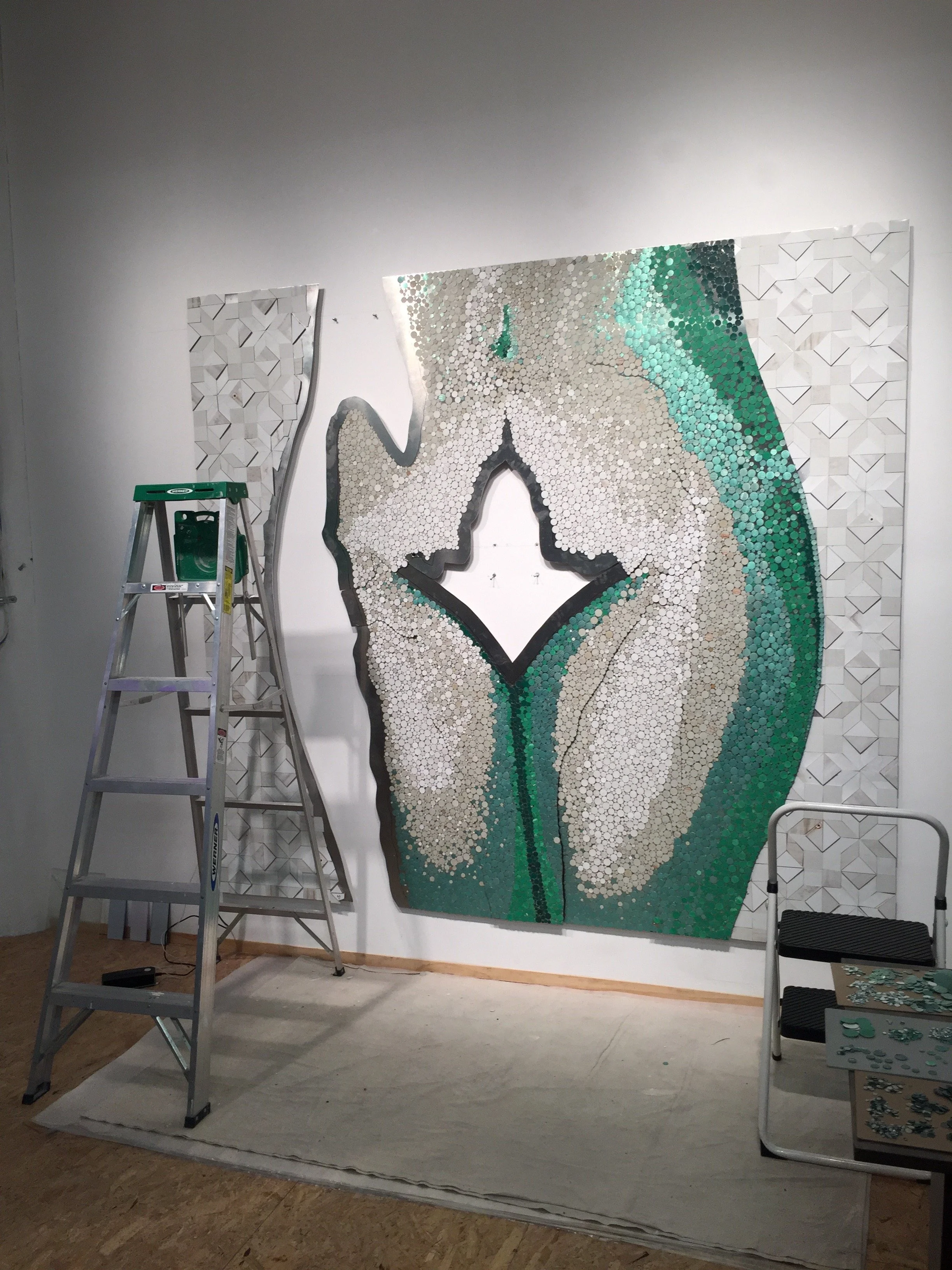
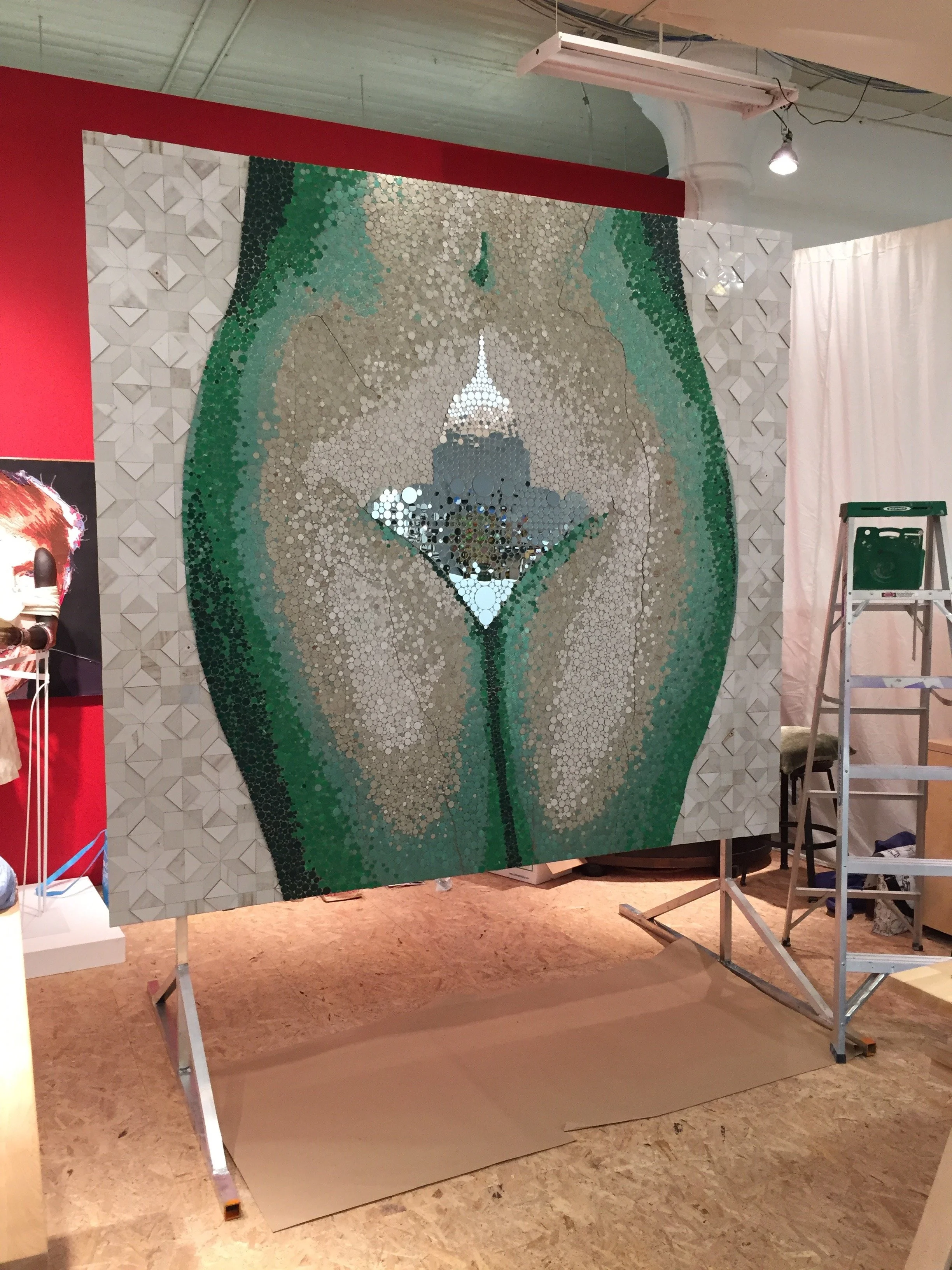
During the making of Hills & Valleys, aluminum signs from defunded Planned Parenthood health centers in Wisconsin were carefully deconstructed, repurposing nearly every square inch of the signs into the artwork. Hills & Valleys unites these reimagined materials to create a large scale sculptural image of the hips, groin and thighs of a woman. Atop her pubic mound is a mirrored vajazzle of our nation’s capitol.
A traditional American star quilt pattern known as “Sarah’s Choice” forms a backdrop behind the hips. This element integrates the language of women’s traditional craft into the artwork, infusing notions of heritage and heirloom as the fabric upon which reproductive rights have been forged by feminists in the present and past.
The US Capitol is symbolically placed at the center of the artwork, to carry forward the central intention of the piece, as it is the place where decisions take place legislating a woman’s liberties over her body. The mirrors, purchased at Hobby Lobby, not only mimic the sparkle and appeal of vajazzle, they also reflect the viewer. At a time in our nation's history it has never been as important for people to take hold of their power to choose our legislators.
In short, when they tear us down, we rise. When we vote, we win.
NEWS:
Hills & Valleys was unveiled at Planned Parenthood of Wisconsin's 80th Celebration on October 14th, 2016. During this incredible event, I had the honor of accepting the 2016 Voices Award for my visibility in support of women's reproductive rights through the making of this piece. Currently on view at my studio in Material Studios & Gallery, Hills & Valleys will begin national travel in mid-November as part of a collaboration between Niki Johnson Studio and Planned Parenthood affiliates across the country.
Hills & Valleys is designed to travel so it may stand with communities across our country. The artwork can hang or free-stand and breaks down into four crates. Updates on when and where Hills & Valleys will be on view will be updated on this blog as they become publicly available. Feel free to contact me if you are interested in bringing it to your area.


In Closing:
While Hills & Valleys is made out of signage from five defunded Planned Parenthood health centers in Wisconsin, I see it as being symbolic of a larger national fight for reproductive (and therefore human) rights. And while Hills & Valleys was independently produced in my studio without sponsorship from any organization and is currently owned by my studio, it wouldn’t be where it is without the collaborative relationship that I’ve developed with Planned Parenthood.
This collaboration began with a friendship and that friendship began four years ago. I met Linda Neff before Eggs Benedict was made. When that story went viral, Linda became a personal friend and ally helping me think through live television interviews, and laughing me out of some of the hardest moments. This spring, it was Linda I reached out to to say I had a design, a shop and was moving forward with the piece made out of Wisconsin's signs. As an independent artist, I value my independence- but as a steward of the signs and supporter of Planned Parenthood, it was time to make that call.

Linda Neff and I standing together during Planned Parenthood of Wisconsin’s 80th Celebration - Voices Award Ceremony (Image courtesy of Lee Matz, Milwaukee Independent)
Over the past year, Linda not only supported every aspect of my vision for Hills & Valleys (from the first day we sat down this spring and I showed her the design, to the unveiling ceremony a few days ago), she has worked tirelessly to create opportunities to help this piece do her work. The future of this piece will ever benefit from efforts of Linda.
To the moon and back, thank you Linda Neff.
Many many more thanks to my good friends, co-conspirators and volunteers:
Thank you Linda Marcus, Glenn Williams, Doug Cheever, Joseph Johnson, Kayle Karbowski, Audrey Jerebek, Claire Desfor, Fran Kortof, Sam Kortof, Stephen Kortof, Jess Haven, Dave Blank, Gerry Wuersling, Margie Hess, Emma Robbins, Aza Quin-Brauner, Katie Mullen, Jordan Pintar, Jason House, Helen Hardinger, Chuck Hardinger, Johanna Kuhn, Brian Kuhn, Abby Campbell, Katrina Sustacheck, Breanne Pemberton, Nicole Schanen, Kerry Tylenda, Jeanne Olivieri, Andrew Nordstrum, Brittnay Nordstrum, Yvette Pino, Carley Knight, Denita Long, and Robert Dempsey for the time, effort and stories shared in creating this piece.
It is all that much more because of you.